Building upon the foundation of the historic LUC collection of the 1990s, the evolved 1860 isn’t merely the best dress watch in the Chopard stable. It’s a benchmark for that style across the entire Swiss watch industry.
Timepiece-obsessed Forbes readers may recall that, as part of our Watches & Wonders coverage back in April, we made it a point to call out the L.U.C 1860 — Chopard’s ultimate expression of the archetypal, three-handed dress watch. That new release, I wrote, was “practically identical” to the inaugural version released in early 2023: the major distinction being a swap in dial colours, originally from salmon-pink to a rich navy hue.
With the Calibre 1.96 — the historic movement that powered the original L.U.C 1860 of the ‘90s — celebrating three decades in 2026, there’s never been a better time to talk about how that proposition has evolved — in the guise of the salmon version that has been accumulating a cult following these past three years.
The team at Chopard Australia saw fit to lend me an example of the modern L.U.C 1860, which you’ll see photographed throughout, for this review. Where appropriate, I’ll be making a few comparisons with the ‘90s original. It’s certainly not essential that you be familiar with that version. Nevertheless, it’s important to draw a connection at several intervals: so we can better understand how Chopard’s combination of restraint and refinement has contributed to a design that is, on the whole, even better than the original.
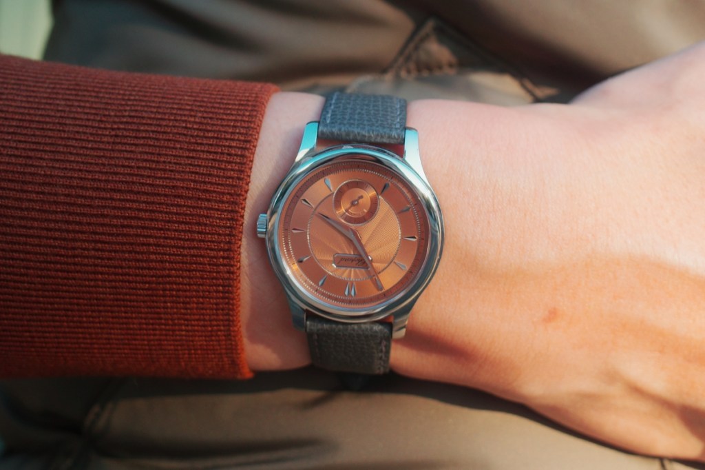
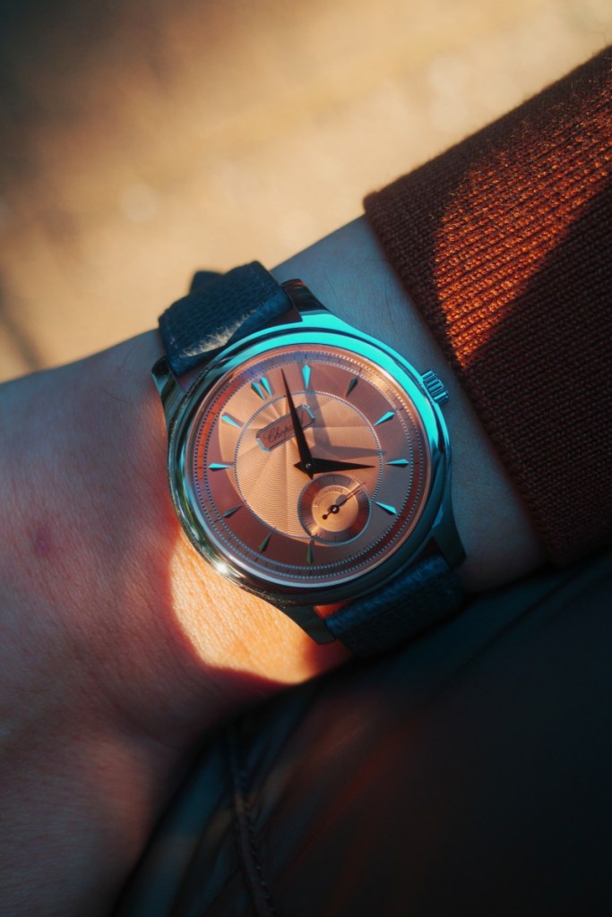
The case clocks in at 36.5mm x 8.2mm. On paper, that already makes it an appealing proposition to classic watch enthusiasts, giving it the wrist-print of something like a mid-size Royal Oak or the current-generation Rolex Explorer I. What the 1860 has in common with those iconic designs is that it’s incredibly easy to wear — statistically flattering all but the burliest of wrists (and vice versa). The lugs are short, rounded, and curve gently downward: contributing to a fit that feels close, but comfortable.
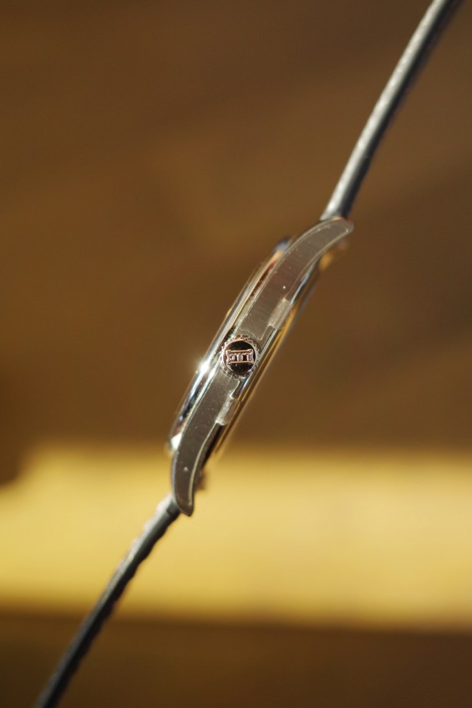
As I wore the watch, basically uninterrupted for a week, the adjectives that kept coming to mind were ‘elegant’ and ‘balanced’. This is due to more than just the 1860’s sizing. The combo of tonal-colour-on-steel, and the decision to style the watch on a heavily grained anthracite strap, give it a surprisingly contemporary posture — something that became ever more apparent as I wore it alongside knitwear, sportcoats, and even the occasional sweatshirt.
Top surfaces, most notably the bezel, are decorated with a fine mirror-polish. Under sunlight, the effect is subdued, helping to subtly frame the many intricate layers of the dial (more on that shortly). Even so, at a distance, the 1860 never tips fully into the sort of ‘dressy’ territory best exemplified by watches like the Reverso Tribute.
A big part of this, I’d wager, is the vertically brushed finish deployed on either side of the case. Bystanders who glimpse the watch, halfway out of a trouser pocket or beneath your shirt cuff, are given the impression of a more rugged, industrial object.
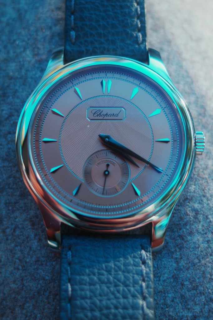
While it’s possible to tell modern and vintage 1860s apart on the basis of slight size differences — a feat of weapons-grade nerdery — the easier method is to look at the dial. All the versions circa 1990 incorporate a date window at 6 o’clock; and while that detail definitely doesn’t ruin the dial’s overall coherence, the choice to omit it in the modern 1860 has been met with near-universal acclaim.
Of course, the merit of that tweak is very much a matter of personal taste. I, for one, think removing the date ultimately strengthens the purity of the 1860’s design. Even in its original guise, the watch was meant to be the peak expression of fine watchmaking (realised using cutting-edge technologies).
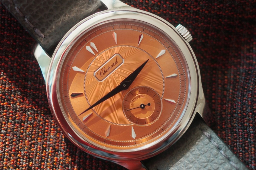
Now, with no date to distract, all of the traditional elements baked into that concept — like the three decorative finishes used to showcase each of the dial’s individual sectors — can shine uninterrupted.
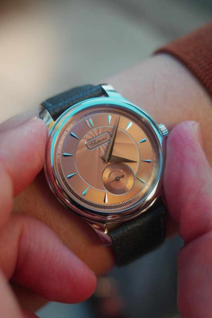
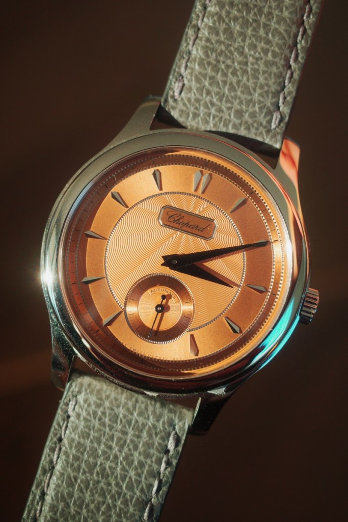
For those unfamiliar with the 1860, the most striking of these details is definitely the guilloche: a form of traditional hand-applied engraving that ripples across the central part of the 1860’s dial.
The wavy, almost petal-shaped motif emanates from the ‘Chopard’ nameplate at 12 o’clock; and is, in fact, engraved out of white gold. This is the single biggest concentration of precious metal across the entire design, though gold is also used for the hour markers and dauphine hands.
My only real practical gripe is that I wished Chopard’s designers had opted to lume these time-telling elements: in doing so, making the contemporary 1860 aesthetic a bit more explicitly casual. As it stands, the white gold hands and indices remain highly readable in low/ambient lighting. They even do a neat job of simulating the colour temp of your immediate surroundings.
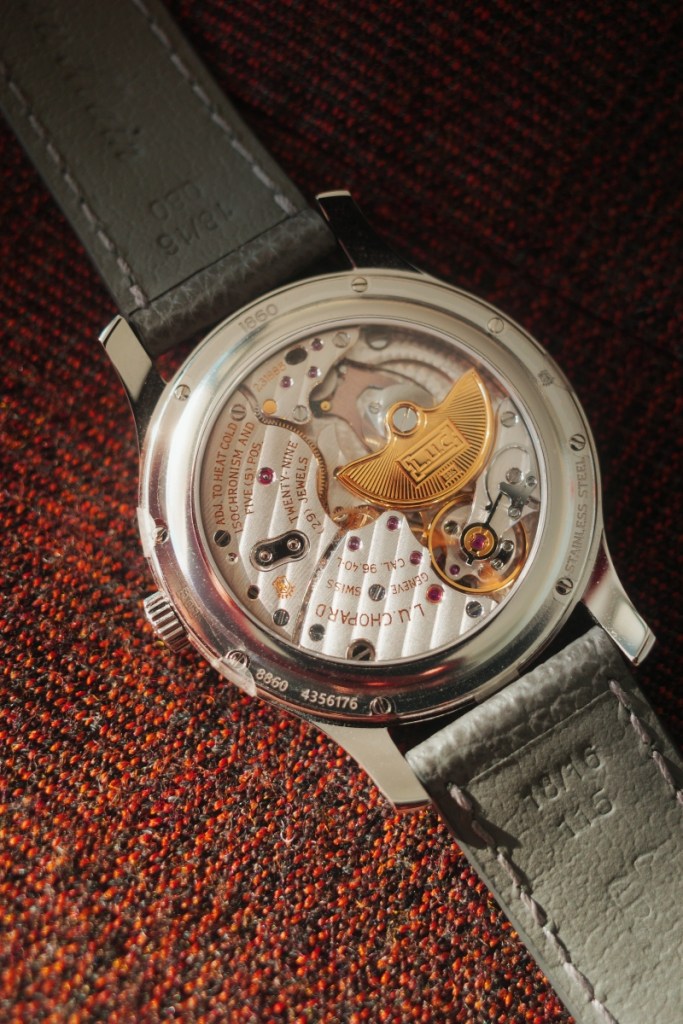
You definitely don’t need to be an enthusiast to appreciate the beauty of the 1860’s dial, or how it looks and wears on the wrist. But in the case of its movement — exhibited through a fully transparent caseback — your enjoyment will be that much deeper if you’re open to a brief history lesson.
Put simply, the movement inside the current 1860, known as the calibre 96.01, is descended from the calibre 1.96 — one of the critical breakthroughs to emerge from the original LUC project. It was developed in response to the Scheufele family’s ambition, who’ve owned Chopard for three generations, to reassert its chops as a serious watchmaking house: every bit the technical equal of a brand like Patek Philippe or Parmigiani Fleurier.
Karl-Friedrich Scheufele (now Co-President of the company) was so committed he greenlit two years of resources, and the involvement of a certain Jean-Frederic Dufour, for the purposes of this undertaking. Lo and behold, the calibre 1.96 was born.
The movement, with its 22k gold micro-rotor and beguiling tableau of stripey jewel-studded bridges, figured prominently in the 1860’s reception as one of the most beautiful dress watches of the ‘90s. In 2002, TimeZone critic Walt Odets went even further, calling the 1.96 “probably the finest automatic movement being produced in Switzerland today”.
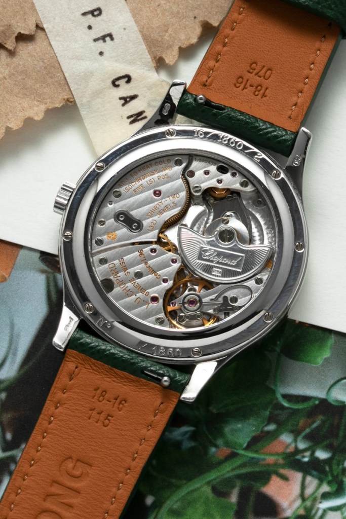
Knowing all that, it’s apparent that the calibre 96.01 has some pretty big shoes to fill. Chopard’s watchmakers have nailed the balance, by and large: the edge of each bridge is elegantly beveled, screwheads are polished to a silky shine, the distinctive ‘Swan neck’ regulator still cranes over the hairspring, and the general sense that one is wearing a beautiful handmade mechanism, finished to a uniformly high standard, remains intact.
Indeed, there are really only two significant changes to the original 1.96 architecture and both should be considered functional improvements.
By removing the date, Chopard has been able to reduce the size of the current movement to 3.3mm; whilst now incorporating ‘hacking’ seconds. When you pull the crown out to set the time, the seconds hand freezes in place — resulting in a movement that is even more accurate than its predecessor.
Charting the evolution of the 1860’s movement is, equally, a useful device for understanding the strengths of the watch itself. The modern execution, whether in this coppery salmon hue or the more mainstream ‘Areuse’ blue, preserves everything that deep-cut enthusiasts loved about its predecessor.
Yet those characteristics, like the versatile 36mm case and ultra-thin automatic movement, have been honed for daily life in the 21st century. The introduction of stainless steel (Chopard’s own ‘Lucent’ strain, at that) and a time-only display are proof of this intention: to make the 1860 as relevant for as many lovers of classic watchmaking as possible.
Do I think the brand has succeeded? Judging by the fact I’ve just written 1,200 words on a watch that’s been in the market more than three years, you can probably guess the answer.
Want to see more Forbes articles on your feed? Tap here to make Forbes Australia a preferred source on Google.
Look back on the week that was with hand-picked articles from Australia and around the world. Sign up to the Forbes Australia newsletter here or become a member here.